Wednesday 25 February 2015

Front Cover Feedback


Sharna
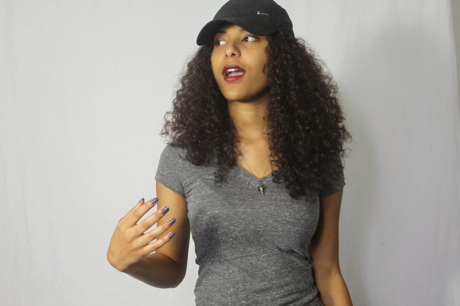
The main image is definitely the focus of the magazine. You can tell it’s a hip hop magazine. I like the colour schemes which you’ve used too.  If I was a reader I’d want to get a copy of this magazine.


Selina
I like the colour scheme. It works well with the genre of your magazine and with the main image of your magazine. The quote is engaging and makes me want to read on. I like the font of the masthead it’s clear and I love the price.


Tamera
I love the angle of gaze that the model is giving me – it really lures me in as a reader. It’s really effective. I also love the quote and the colour scheme too.


Lois
The front cover image is clear and the shot is in focus I like the tagline and the masthead and colour scheme a lot too.


Kenriqué
I like it. I like the font. I think that it’s very eye catching and I love that it’s simple. It’s got a great price too.


Stacey
I like the masthead and the font that’s been used for it. It is very eye catching and bold.


Bryana
I like the colours used and the picture is very effective. I like that the price is not too cheap and not too expensive. The font is also clear and easy to read.

Tuesday 24 February 2015

~*Front Cover Features*~


For my Front Cover Features, I added the price of my product, the barcode, the date, a pull quote from the Cover artist's interview and musical events which relate to the genre of my magazine such as WIRELESS Festival which had been announced around the same time as my research, Big Sean's Album, which had just been released around the same time as my research and also the TV show 'Empire' which was also running while I was carrying out my research.

~*Masthead Font Decisions cont.*~

After much thought I decided to choose the 'Hong Kong Hustle' font for my masthead as it is innovative and I feel it will draw in potential readers, especially after I change its appearance on photoshop.


~*Masthead Font Decisions*~

Here are some fonts from www.dafont.com which I look at for my masthead on the front cover of my magazine.


~*Photoshop Manipulation*~

~*Masthead Name Change*~


~*Cover Layout Decisions/Photoshop*~

Sunday 22 February 2015

~*Cover Layout*~


                                     This is my front cover layout of my magazine. 

Saturday 21 February 2015

~*Front Cover Shot*~


 I chose this shot to be my front cover because the camera's angle slightly tilted upwards so model's angle of gaze is lowered so that she it looking down at the reader which is intimidating. This links to the genre that my magazine focuses on  which is Hip Hop as most rappers in the game on a typical music magazine appear to be fierce, aggressive or intimidating as I said before. I will havew to play around with lighting in this photo to get rid of the backgroud behind the model to make it dazzling white. I may also have to use Photoshop to eliminate any skin blemishes/ imperfections to get a flawless, natural finish which is what I'm going for.


Friday 20 February 2015