
Wednesday 25 March 2015
~*Evaluation Question 7*~
Looking back at your preliminary task what do you feel you have learnt in the progression from it to the full product?
Looking back on my preliminary task, I have learnt various new technical skills as well as how to create a successful product. My preliminary task was very bland and included no sense of creativity and the contents did not match with the cover. However, in my full product I have ensured a consistent colour scheme in order for all my pages to look as though they’re from the same magazine. My school magazine looked empty whereas my full product has a small amount of writing to match my style model VIBE. However, still looked like a legitimate magazine. I feel that since my preliminary task I have progressed as beforehand I did not really understand how to attract an audience successfully. I used extremely bright colours, however I used too many different ones meaning my task had no organisation. My contents page looked dull, including no exciting colours which contrasted to the front cover making them look like two separate magazines. However in the full task I ensured that my contents page fit in with my cover using eccentric colours effectively. I believe that my final product looks a lot more professional, I think this is because I had a style model to follow as well as research I had done on various other magazines. My preliminary task helped me to reflect on what I was doing wrong so that I could improve this within my final magazine. I realised that image quality and model choice was important, in my school magazine I used blurred images where my models did not represent anything however my final product images were better quality and represented the genre of my magazine well. The layout of my magazine was also important. My preliminary task did not have a specific layout causing it to look disorganised and unprofessional, to ensure my final product could be sold next to huge magazines such as VIBE, NME, XXL and Q, I followed the layout of my style model in order to create a genuine feel to my product. My Photoshop skills lacked at the beginning of the course however after the preliminary task I was able to learn how to use various tools such as blur and brush tool, this helped as I used these on my final product. The use of fonts in my preliminary task did not look effective, or ‘stand out’ to attract an audience. However I was inspired by VIBE to use simplistic fonts using the drop shadow tool to make the text more prominent. My school magazine was targeted at a niche audience however my final task was aimed at a much wider audience, having audience feedback to create the product, I was able to create a successful product. I did not have any audience feedback for my preliminary task so I did not really know what the audience wanted. I also made a double page which was a challenge but I feel as though I've over come it.


Preliminary Task
~*Evaluation Question 6*~
What have you learnt about technologies from the process of
constructing this product?
Photoshop was the programme that I used to create all of my magazine pages. There is obviously a lot of things that I don't know about it, but I knew that I could create a half-decent quality magazine using it, so that's why I decided to use this programme. I learnt how to use the programme a little better in my main task by looking through tutorials on Google and YouTube etc. and asking my Media teacher. I learnt how to a lot of new things such as text effects, and how to hide skin blemishes, scars and spots using the healing tool and the patch tool. I learnt new keyboard shortcuts as too, which saved me from constantly going through the drop down menus. This included things such as taking a step backwards and taking a step forwards. I knew how to do this on a Windows computer, but I'd never really needed to do it on a Mac before, so this is something that I learnt throughout this process.
Dafont.com is the website that I used to download the majority of the fonts on my computer. I find that the programmed fonts on an iMac to be very basic, so I went on Dafont and downloaded a load of fonts that I could possibly use for my magazine pages. However, when it actually came down to it, I actually used Arial Black for the majority of my fonts, so the website didn't come in that handy for me. However, I do think that it's a really great website and I will definitely use it again.
This a Canon EOS 400D camera to take all of the images for my magazine pages. Although I have several cameras laying about the house, this is the most professional one that we own, and it would produce the most 'professional looking' images. So, considering that my job was to create a conventional, professional looking magazine, so this was the camera I decided to use. When I was taking pictures though, because the camera is quite heavy it was quite annoying to take around everywhere, so if I was to do something like this again, I would perhaps use a different camera. I did manage to get some good quality images using it though, so maybe it was worth it.
I only used SoundCloud once for my third evaluation question. It's a good programme to use as you can share it to Blogger really easily. I can't imagine needing to use it very much if you were creating a magazine, but it came in quite useful for me, so I wouldn't completely knock it.
I used YouTube twice in my project as I had to use its services to host the videos that I had created using iMovie and a camcorder. It takes quite a long time to upload the videos, especially if you want to upload the video in quite high quality.
I used GIFmaker (gifmaker.me) to create GIFs to animate my blog and make it pop. It was really easy to use and the results were great.
Powtoon was a useful tool in terms of helping me to produce the work for my blog. I found it very complicated and confusing when I first used it but by the end of this course work stage, I felt that I’d mastered it.
I thought I was familiar with Flickr before this process since I had used it a couple of times but I probably wouldn't ever use it again, unless it was entirely necessary as it was so confusing and the site updated itself since I last used it. It was quite hard to understand and I couldn't really find my way around it very well. I also couldn’t find a way to share the pictures I had taken to blogger as I had used it to display my contents page shots, so I ended up screenshotting the page and upload that screen shot with the link to the pictures, so I probably wouldn't ever use it again unless I really needed to.
To conclude, what I’ve learnt from this process is that despite the fact that there are a lot of disadvantages to using technology and it can be very, very unreliable, I would have never been able to anything without it, and my magazines wouldn't even exist today without it.
~*Evaluation Question 5*~
How did you attract/address your audience?
To find out what would attract my audience, I had to do research into existing magazines on the market. After looking at VIBE and Rolling Stone magazine, I found that although their genre of music was different, the style in which they sent pages out would be good for my target audience, as it gets a lot of information onto the pages, but in a suitable format to read, being broken up by pictures. VIBE magazine, normally have a dominant image on 1 page, and a lot of text on another. This might bore my target audience, as the younger you are, the shorter your attention span, and a lot of text with no images may be daunting for them to read, therefore I chose not to use there method.I asked to those people who brought magazines, what magazines they brought. I thought that because my sample was so small, that I should research that on a bigger scale as the results were already collected for me to access via the internet on the national readership survey website. After looking at the research, I found that XXL and NME was mostly brought by people ages 16-25. And VIBE and Rolling Stone magazine was mostly brought by the same age category. It was pretty conclusive that I should aim my magazine at younger years within this category, as it seems a successful one to chose, considering how successful those magazines are.
Then I need to focus on what I would need to fill the magazine with. So I asked people what they like about the magazines they would buy. Results shown that the majority of people researched said the price and the content inside the magazine. This meant I would have to focus on getting the right price for the magazine to sell and getting quality and a great layout content that people would want to read.
The next thing I had to focus on was what time of genre of music should my magazine specialize in. Results were pretty inconclusive as most people liked almost every kind of music I listed, and after looking around at other magazine, I found that only Q magazine covered all genres of music. As my magazine fitted into a niche market, I decided to use VIBE’s idea of covering hip hop and RnB genres which would be perfect for the age group I aimed for. Therefore I would not be losing out to anyone choosing to buy VIBE over my magazine or not purchasing my magazine at all, as it’s not the same target audience.
I also added social media forums which the audience can contact and keep up to date with.
~*Evaluation Question 4*~
Who would be the audience of your media product?
The target audience of my media product is anyone between the ages of 16 to 25. This is because although a new wave of artists have come and changed the dynamics of this genre by adding their own twist in the craft, they’ve also stayed within the conventions of the genre so people who may be older and would enjoy the more older hip hop tracks can enjoy the magazine because it’ll feature certain artist from that particular era and also someone who is younger may enjoy the newer urban artists and can find that the magazine appeals to them as well. I have also chosen this age group as my earlier research into the genre, hip-hop, informed me that its growth in popularity in was the 90’s - this means that people who were in their teens at that time are aware of this genre and anyone who was born in the 90’s and grew up with this music when it was at its peak, like myself, will enjoy the genre. Hip-hop may have a disproportionate number of male artists to female artists belonging to this genre, but it is enjoyed and listened to by an audience equally made up of all genders. This particular issue may appeal more to a female audience. This was a conscious decision I made after doing research into magazines and had found that many urban, hip-hop and Rn’b magazines featured more male artists on their covers, in their articles and I feel that the features appealed more to a male audience. I guess saw this opening in the market and wanted to create something that a female audience may enjoy more and may be able to relate to. My magazine is a monthly magazine consisting of 40 pages and priced at £2.15. I gave it this price to challenge the convention to have a price that ends in 99p and also because as a monthly magazine it should be affordable for students.
Tuesday 24 March 2015
~*Evaluation Question 2*~
In what ways does your media product use, develop or challenge forms and conventions of real media products?
I made my magazine to represent the age range of both male and female from the age of 16-25. This specific edition is targeted more at a female audience group than a male audience, but should it still appeal to both genders.
My magazine is stereotypical of people that have a taste in music that is both hip hop and rn’b genres, therefore it wouldn’t appeal to people that enjoy listening to to rock or heavy metal music. Although some issues may attract people that like other genres such as pop depending on who is on how is on the cover of the magazine in that issue and what the content of the magazine is.
I aimed for my magazine to inspire people to be who they want to be, do what they want to do and most of all follow the music trend they want to follow. I wanted my magazine to represent the latest trends and music updates are to discuss current social affairs so that people have the opportunity to follow and like whoever they want too, it doesn’t tell them they have to like this music but gives them the choice to.
Before I started making my magazine I chose to aim my magazine at students because my target audience range is aimed at both genders aged 16 – 25 and I know that they may not be able to afford the real up beat classy expensive magazines on a monthly basis, so I chose to create a magazine that was affordable which is aimed it at this group but also had the content needed to follow the genre of the magazine and to represent who the magazine is made to represent.
~*Evaluation Question 1*~
In what ways does your media product use, develop or challenge forms and conventions of real media products?
The audience for my magazine is targeted at around the age of from about 16 early 25 year olds. Almost all of and VIBE's readership is from around this age gap. There magazines are very successful, therefore I want to fit my model my magazine to fit this social group.There mode of address is however quiet an informative one, but to fit my magazine to reach the lower half of the age group, I want to make it formal but in a chatty tone so young people are attracted to reading my magazine and can easily understand no matter how intellectual they are.
My magazine is aimed at both genders as it is filled with things for both male and female artists loved by both genders. The music genre for my magazine covers all areas such as Rn'B and rap, as it focuses on new artists and current news from current popular artists.
The magazine content is mainly focused around what my target audience wants, such as interviews with big stars, reviews on festivals and concerts. My magazine however does not cover much classical music as from the research I conducted, I found that it was not popular within the teenage community; therefore it is featured in my magazine, however only in small doses and occasionally compared to other popular genres, as the audience wouldn’t be too interested in it from the results.
The design of my magazine is quite a simple front page as I didn’t want to make it to cluttered. However I still wanted to make it attractive to a young audience, so I filled it will different text types and shapes etc. Images are used quite simply, but effectively.
Like VIBE magazine, they are used to separate boring and long winded text so the user is still attracted to reading it without thinking its to much writing so they don’t want to read it. Also images are used to create posters. My magazine will feature pull out posters of artists, which the younger generation may buy to decorate there rooms with, therefore appealing to a big range of people.
The colour scheme of different shades of re, black and white is continued throughout my magazine as the user can identity the colour to the magazine in time to come. The style of writing throughout my magazine will continue to be informative, but chatty and friendly so it appeals to a younger audience.
Wednesday 18 March 2015

~*DPS Image*~

This is the image that I will be using for my double page spread. I will need to adjust the brightness on photo shop to get rid of the cloth background to make the background completely white so the the muse stands out more.
~*DSP Interview Introduction*~
Take-no-prisoners rapper and singer from Philadelphia LIONE$$ is here today with The Movement. In a scene saturated with up and comers, LIONE$$ qualifies as a triple threat with her ability to switch between smooth R&B vocals and hard-talking gritty bars. At 23, she's already released four mixtapes, including October's anthemic ‘Open Season’, and has collaborated with the likes of Lil’ Wayne, Drake, Meek Mill, Nicki Minaj and Drake. Here she talks about her struggles as a female in the game and her anticipated debut album ‘ETHER’ and also defying the stereotypes of a femcee.
~*DPS Research: Interview*~
I watched these interviews for my Double Page Spread interview. I hoped to be influenced by the questions and answers to that I able to answer questions from a female rapper's point of view.


Sunday 15 March 2015
~* DPS Research Analysis *~
This is some Double page spread research which I underwent. The double page spread is from NME magazineand the cover artist was Nicki Minaj, an new female rapper (at the the time). I would like to use the design and layout of this double page spread becuase I feel that it suits the rest of the product well. I will also have to use a darker colour way because the artist which I created isn't really as colourful as Nicki is, her persona is darker and rougher in comparrison to Nicki's bubblegum pop barbie persona.
Thursday 12 March 2015
~*Contents Page Feedback*~

The main image on the contents page page is very engaging due to the fact the model is staring straight into the camera. The contents page is minimalistic, very straight forward which I like and I love the fact that the product has social media accounts too.
Saturday 7 March 2015


Friday 6 March 2015
~*Contents Page Layout*~

Thursday 5 March 2015
~*Contents Page potential shots*~

Here the additional photos which took for my contents page. I uploaded them onto flickr.
https://www.flickr.com/photos/54311748@N04/sets/72157651118607429/
Tuesday 3 March 2015
Wednesday 25 February 2015
Front Cover Feedback

The main image is definitely the focus of the magazine. You can tell it’s a hip hop magazine. I like the colour schemes which you’ve used too. If I was a reader I’d want to get a copy of this magazine.
Selina
I like the colour scheme. It works well with the genre of your magazine and with the main image of your magazine. The quote is engaging and makes me want to read on. I like the font of the masthead it’s clear and I love the price.
Tamera
I love the angle of gaze that the model is giving me – it really lures me in as a reader. It’s really effective. I also love the quote and the colour scheme too.
Lois
The front cover image is clear and the shot is in focus I like the tagline and the masthead and colour scheme a lot too.
Kenriqué
I like it. I like the font. I think that it’s very eye catching and I love that it’s simple. It’s got a great price too.
Stacey
I like the masthead and the font that’s been used for it. It is very eye catching and bold.
Bryana
I like the colours used and the picture is very effective. I like that the price is not too cheap and not too expensive. The font is also clear and easy to read.
Tuesday 24 February 2015
~*Front Cover Features*~

~*Masthead Font Decisions cont.*~
After much thought I decided to choose the 'Hong Kong Hustle' font for my masthead as it is innovative and I feel it will draw in potential readers, especially after I change its appearance on photoshop.


~*Masthead Font Decisions*~
Here are some fonts from www.dafont.com which I look at for my masthead on the front cover of my magazine.


Sunday 22 February 2015

Saturday 21 February 2015
~*Front Cover Shot*~

I chose this shot to be my front cover because the camera's angle slightly tilted upwards so model's angle of gaze is lowered so that she it looking down at the reader which is intimidating. This links to the genre that my magazine focuses on which is Hip Hop as most rappers in the game on a typical music magazine appear to be fierce, aggressive or intimidating as I said before. I will havew to play around with lighting in this photo to get rid of the backgroud behind the model to make it dazzling white. I may also have to use Photoshop to eliminate any skin blemishes/ imperfections to get a flawless, natural finish which is what I'm going for.
Friday 20 February 2015


Wednesday 21 January 2015
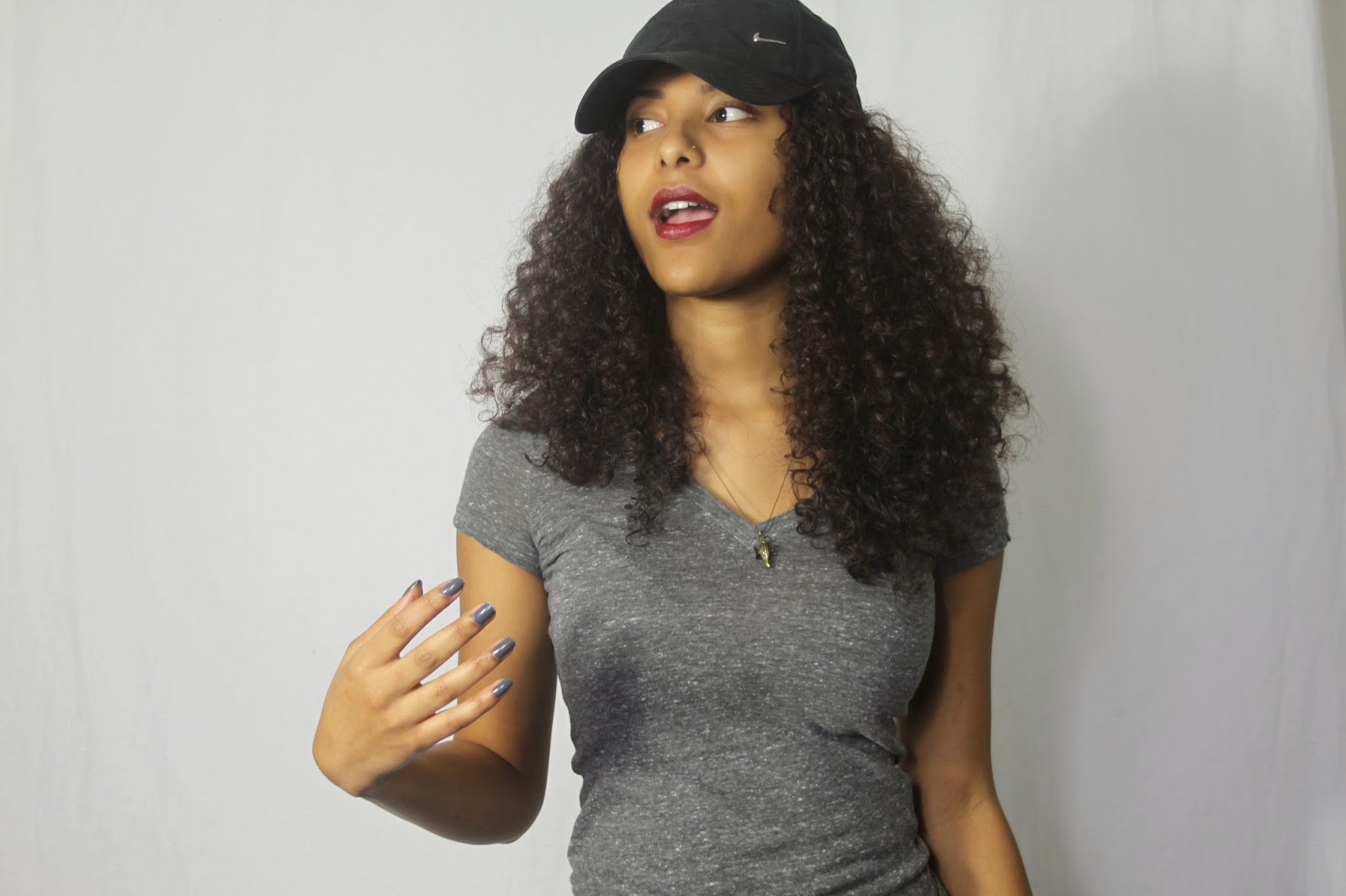
~*Test Shots*~


These are the tests shots which I took of the muse for my front cover. We played with different poses but I feel as though I need to take some more with a different mise-en-scene so that I can choose my front cover picture, my contents page picture and my double page spread picture from a selection of high quality shots instead of these basic test shots. I also need my muse to be wearing lipstick and to have some other props too.
Subscribe to:
Posts (Atom)